
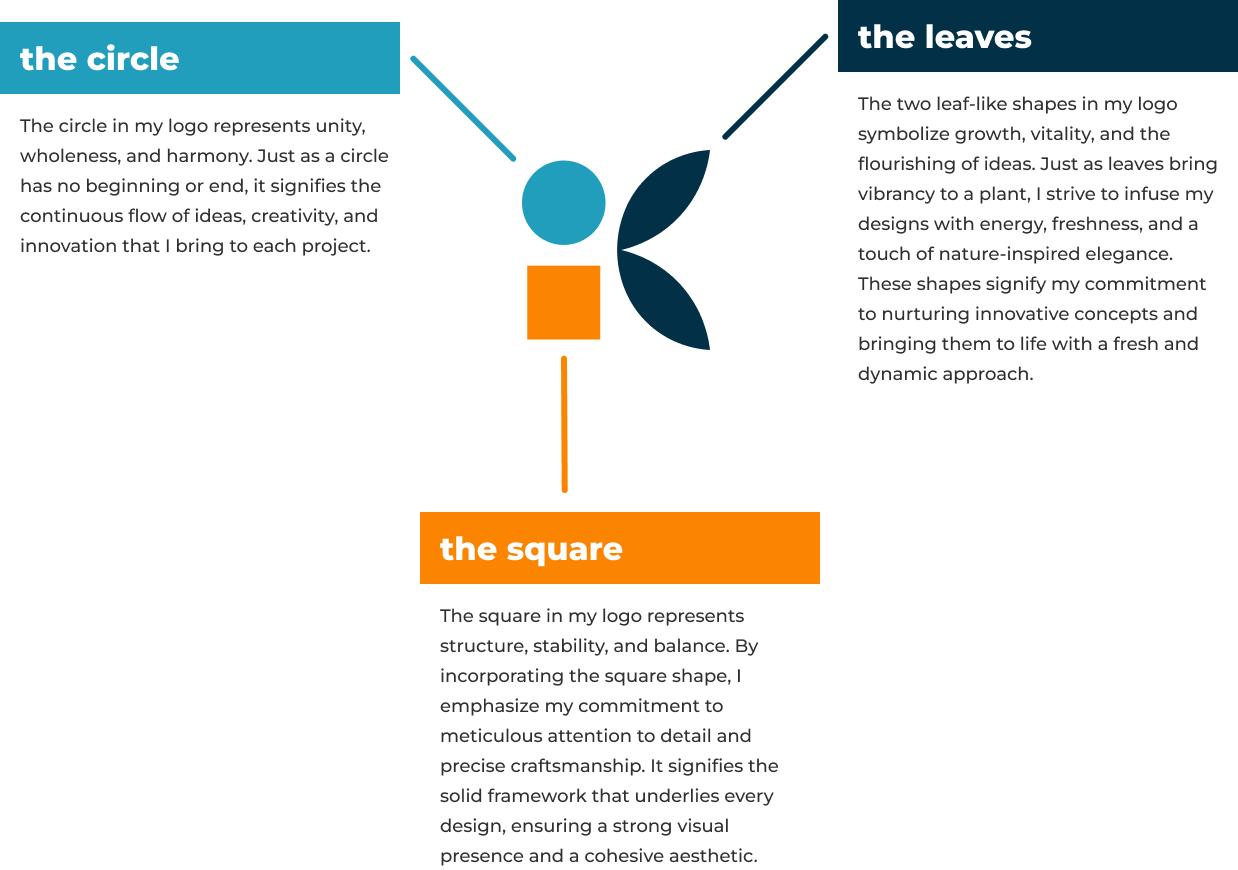
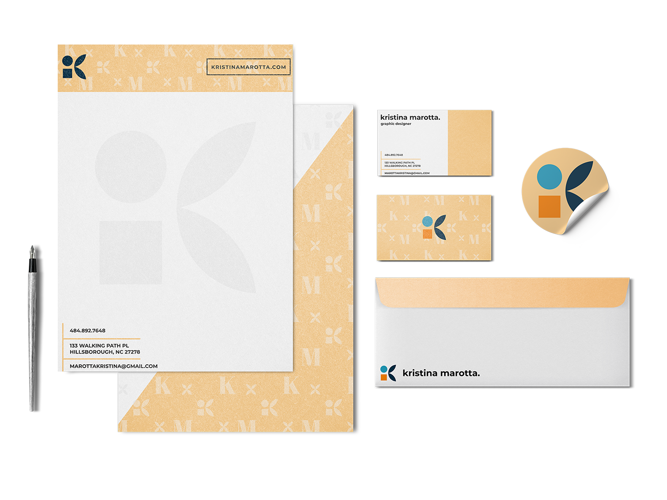
The combination of the circle, square, and leaf-like shapes in my logo represents the harmonious fusion of creativity, structure, and growth. Together, these elements form a cohesive and visually captivating representation of my design philosophy, showcasing the balance between innovation, precision, and organic inspiration that I bring to my work.
"Elevating brands with polished precision."
"Boldly redefining visual possibilities."
"Infusing passion into every design."
"Designs fueled by boundless enthusiasm"
"Inspiring change through captivating design."
"Designs that ignite creative journeys."