
Jul 11, 2023
In the realm of branding, a logo is far more than a decorative element. It's the visual ambassador of your brand, a distillation of your company's essence into a simple, memorable icon. The power of a well-designed logo is undeniable—it communicates, it differentiates, it impacts. But creating such a logo requires more than artistic flair; it calls for a strategic approach. Here are five essential tips to guide you towards designing better logos:
The key to a successful logo starts with understanding the brand it represents. A logo is a visual synopsis of the brand's story, values, and industry. For instance, a tech company might opt for a sleek, minimalist design to convey its focus on innovation, while a children's toy brand might favor a playful, colorful logo. To design a logo that rings true, immerse yourself in the brand—understand its personality, its mission, and its audience.
In our multifaceted digital age, a logo needs to maintain its integrity across a variety of mediums and sizes. From business cards to billboards, websites to social media, your logo needs to be recognizable and effective. Test your design in different contexts—does it still communicate clearly when scaled down for a mobile screen, or when scaled up for a large poster? If not, it might be time for some tweaks.
Color is a powerful communication tool in logo design. Different colors can evoke different emotions and associations—blue can communicate trust, red can signal excitement, and green often represents growth or calm. When choosing a color scheme for your logo, consider your brand's personality and the message you wish to convey. A well-chosen palette can enhance your logo's impact and resonance with your audience.
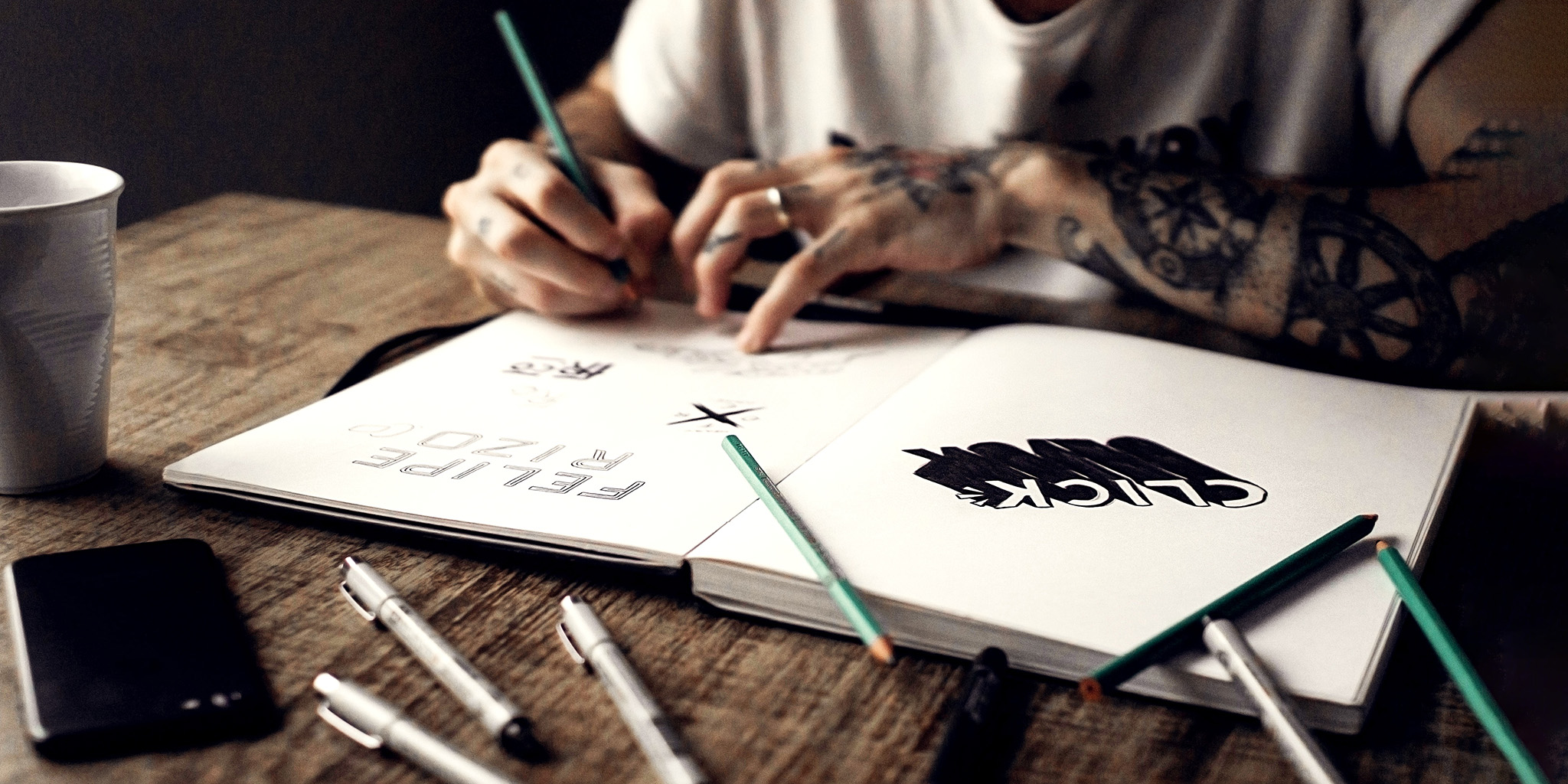
If your logo includes text, your choice of typography speaks volumes. A seriffed typeface might convey tradition and reliability, while a clean sans serif font can suggest modernity and efficiency. Remember, the goal is to choose a typeface that aligns with your brand's personality and enhances readability. Be cautious of overly decorative fonts—they might look interesting, but can often be difficult to read, especially at smaller sizes.
While it's important to stay in tune with design trends, a logo should ideally stand the test of time. Trends fade, but a well-crafted logo stays relevant. Consider the logos of iconic brands like Apple, Nike, or Coca-Cola—they have evolved subtly over the years, but their core design remains timeless. Aim for longevity in your logo design. It's not about catching the latest wave; it's about creating a lasting impression.
Designing an effective logo is both an art and a science. It requires a blend of creativity, understanding of brand, and strategic thinking. These tips serve as a guiding light, helping you navigate the process and emerge with a logo that not only looks good but also resonates with your audience. And remember, if you ever need a helping hand in the realm of logo design, I am here at Aesthetic Alchemy, ready to assist. Together, let's craft a logo that truly embodies your brand.